Role
UX lead – research, journey mapping, user flows, wireframing, prototype testing
Industry
Logistics
01 / OVERVIEW
Open-deck carriers haul the loads that don’t fit in a trailer: machinery, steel, oversized equipment. Every load is a different shape, weight and set of handling requirements, which means every load has to be described from scratch before anyone can price it or move it.
Exo Freight set out to be the platform where shippers and open-deck carriers transact directly, digitally, and without a broker in the middle.
02 / THE PROBLEM
Before the platform, a single shipment was spread across messy spreadsheets with no way to search for a specific item, long email chains, phone calls to drivers just to find out where a truck was, and paper documentation at every handoff. Nothing connected, so the same information was re-entered, re-asked and re-confirmed at every step.
Two parts of that process were harder than the rest. Open-deck cargo has no standard shape, so there was no shared way to describe a load — quoting one took an average of ten back-and-forth exchanges before anyone had enough information to price it. And routes with multiple stops had to be assembled and re-assembled by hand, with each change rippling back out through the same emails and calls.
Consolidating all of it into one system was the brief. Making cargo describable and routes buildable was what made consolidation possible.
Average back-and-forth exchanges before a quote could be priced.
03 / HOW I WORKED
I ran a workshop with the client team to surface how each of them defined success — then had them vote.
The board filled with plausible ambitions: frictionless booking, better pricing, faster payment, automated tracking, an agnostic TMS.
The votes clustered on two: total transparency for customers and employees, and reducing tribal knowledge — the undocumented expertise living in a few people's heads. Not features at all, but properties the whole system needed to have. That reframed the brief: the platform's job was to make what people knew visible and shared, and every subsequent decision was measured against it.

Developers had already produced a partial product. It was missing necessary features and the usability was poor — but auditing it was the fastest way to understand the domain and, just as usefully, to decide what wouldn’t survive into the final product.
I ran the audit against Nielsen Norman Group ten usability heuristics and Baymard Institute usability knowledge base, tagging findings in three categories: issue, idea, and positive detail. The third category mattered — some of what existed was worth keeping, and separating that out kept the audit from becoming a demolition.

I interviewed 3 shippers — a director of logistics, a VP of supply chain, and a logistics coordinator — as well as 2 managers who handle the loads shippers send. Shippers want capacity and price certainty. Carriers want to find loads worth taking and get paid quickly. A marketplace that only satisfies one side doesn’t clear.
I mapped the results into a user journey with detailed notes, which is where the weak spots in the existing workflow became visible.
01 — Spreadsheets with no way to search for a specific item
02 — Heavy email communication for routine coordination
03 — No trust in carriers, because there was no rating or history
04 — Constant calls to drivers, simply because status wasn’t visible
05 — Paper documents throughout

Then features list was produced. The workshop set the direction — transparency, reducing tribal knowledge — and the journey map showed where the current process failed to deliver it. Features came from the intersection: each pain point on the map generated a candidate, and the workshop priorities determined which candidates were worth building first.

04 / DESIGN DECISIONS
The central design move was a single, consistent structure for describing cargo — enough to price and match a load without a conversation.
Creating a load went through more iterations than anything else in the project. Route planning and item description are both dense, and combining them produced a form that overwhelmed people. I split the process into two steps so the user handles a single kind of decision at a time.
Load details could show everything, and showing everything would have made the screen useless. I prioritised the most necessary information into prominence and pushed the rest out of the way. The prioritisation came directly from the interviews rather than from my assumptions — and it was tested afterwards to check the ranking held.

The workshop had flagged this directly: shippers needed to show their organisation what freight was costing and how it was performing — to give the shipping coordinator a voice in the boardroom.
So the left side is the reporting layer: spend per month, load count over time, shipments by location, top lanes by rate. Numbers you can take into a meeting rather than assemble the night before.
The right side is the working layer. Unread messages appear in full, with a generated quote acceptable directly from the panel and a quick response option that avoids opening the thread at all. Everything else on the screen is a route out: 15 loads in transit, 2 delayed, each one tap from the detail.
And because no 2 shippers watch the same numbers, the widget grid is theirs to arrange — anything that isn't relevant comes out, anything missing gets added.

The table was familiar on purpose. What changed was how much it could tell you at a glance.
Shippers were already managing loads in Excel — one row per shipment, filtered and colour-coded by hand. Rather than replacing that mental model, the loads list keeps it: the same scannable rows, the same sense of a list you own. Nothing to relearn.
What the spreadsheet couldn't do was tell you anything you hadn't typed into it yourself. So the columns that matter most are the ones that maintain themselves — route preview, estimated arrival at the next stop, timing status, and an indicator for unread messages. A delay surfaces as a dark badge in a column of quiet grey ones, and a load needing a reply shows a flag.
That turns the list into a triage screen. A shipper opens it and knows within a few seconds which loads are fine and which two need attention — without opening a single one to check.

05 / TESTING
Prototype testing led to a concrete change: an origin/destination switcher when creating a load, because people needed to reverse a route rather than re-enter it. Navigation tested clear. And the sessions surfaced which charts and reports shippers actually wanted, which fed the following iteration.
01 — An origin/destination switcher when creating a load, because people needed to reverse a route rather than re-enter it.
02 — Navigation tested clear
03 — Sessions surfaced which charts and reports shippers actually wanted, which fed the following iteration.
06 / OUTCOME
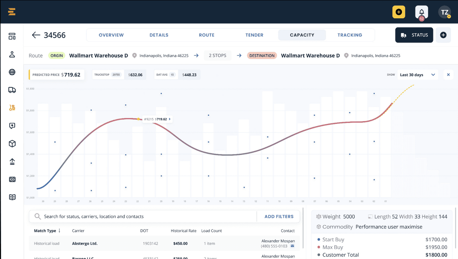
What I designed: a structured way to describe any open-deck load, replacing an average of ten back-and-forth exchanges per quote; a two-step load creation flow; a prioritised load view built on interview data; and a single working surface for managers.
Exo Freight raised a $15M Series A led by Left Lane Capital. Since its initial funding round in June 2021 it reported 33% month-over-month revenue growth and was working with over 50 enterprise shippers.
07 / REFLECTION
The hardest part of a marketplace is the object being traded. Everything else — pricing, matching, tracking — was downstream of whether a load could be described once, accurately.
Auditing someone else’s half-built product is the fastest domain education there is, as long as you’re auditing to decide what to keep, not just what’s wrong.