Now Patient
Online pharmacy for repeat prescription delivery and online doctor consultations.
Role
Research, user flows, wireframing, early prototype testing
Industry
Healthcare
01 / OVERVIEW
Now Patient handles repeat prescriptions, medication delivery, and consultations with doctors and pharmacists — for a UK audience spanning every level of technical confidence.
The brief carried a built-in tension: make it simple enough for someone who doesn’t enjoy apps, while satisfying legal requirements and medical confidentiality obligations that are non-negotiable.
02 / THE PROBLEM
Identity checks, NHS code collection, confidentiality safeguard — each one is necessary, and each one adds friction at exactly the moment a new user decides whether to continue.
You can’t remove those requirements. So the design question becomes: where in the journey does each one belong, and what does the user need to know before they’ll comply willingly?
The competitors had already run the experiments — their reviews were the results.
Before speaking to a single user, I reviewed the UK online pharmacy services already on the market — Pharmacy2U, Well Pharmacy, UKMeds — and read their app store and Trustpilot reviews. Not for feature lists, but for recurring complaints. Where do people get frustrated with a service that, on paper, works?

03 / USER RESEARCH
Recruitment criteria were deliberate: UK-based, and spread across confidence levels — because designing only for people comfortable with apps would have excluded a large part of the intended audience, including many of the people who most need repeat prescriptions delivered.
Three findings shaped the product, and two of them were about trust.
01 — Some people stay loyal to their local pharmacy because the pharmacist already knows them and their needs (3 of 10). An app replacing that relationship has to earn something back.
02 — People worry about how medication is transported: delivery conditions and temperature control (7 of 10). This was the single most common concern.
03 — Asking for the NHS code requires unusual trustworthiness — but when the reason is explained, people become noticeably more willing to share it.
When the reason is explained, people become noticeably more willing to share the NHS code.
04 / DESIGN DECISIONS AND WIREFRAMING
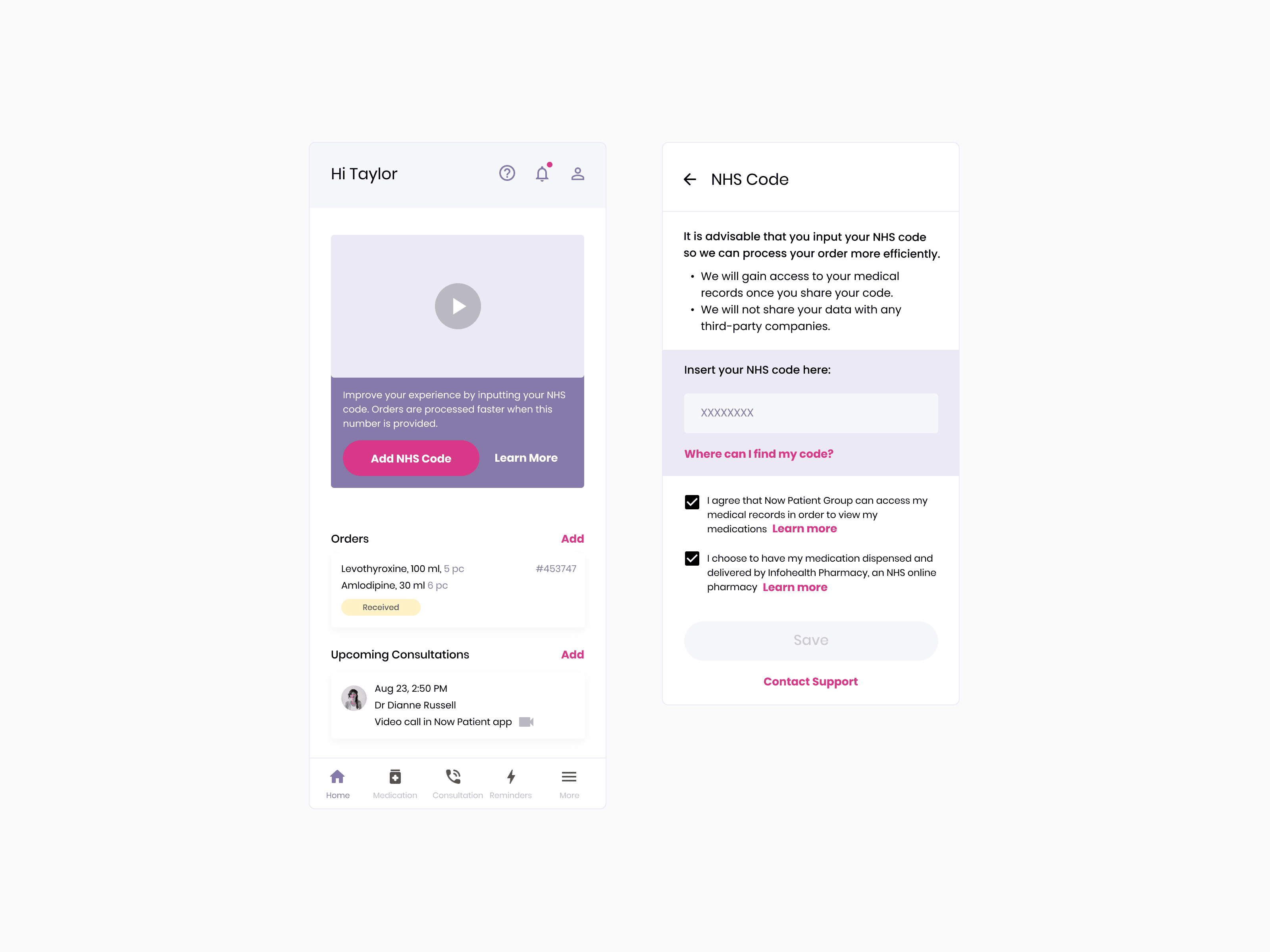
Research showed people treat the NHS code as sensitive information. Asking for it up front meant asking for something sensitive before the user had any reason to trust the app — which loses registrations. So I moved it to after the account exists. By then the user has invested something and has context for the request.
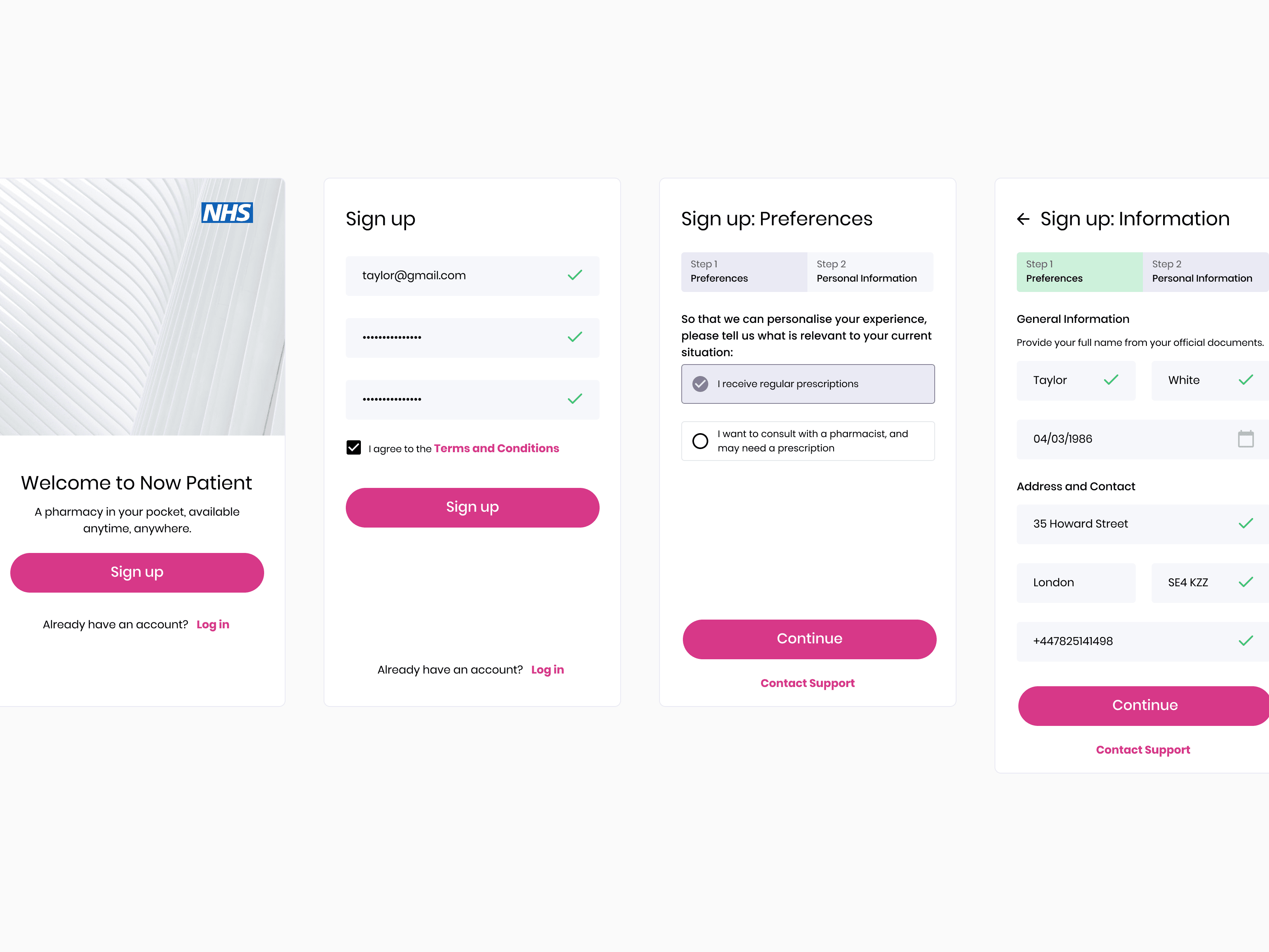
One preferences question up front let everything after it be personalised — including the ask people were most suspicious of.
Splitting users by what they came for — an existing prescription, private order or a consultation — defined which actions the home screen leads with in its empty state. It also sets up the NHS code request: only people with active prescriptions need one, so the app can explain why before asking, rather than requesting NHS credentials from someone with no reason to hand them over.
Some users arrive with prescriptions to manage. Others only want a consultation. Presenting both groups the same screen would have left each of them hunting for their own path.
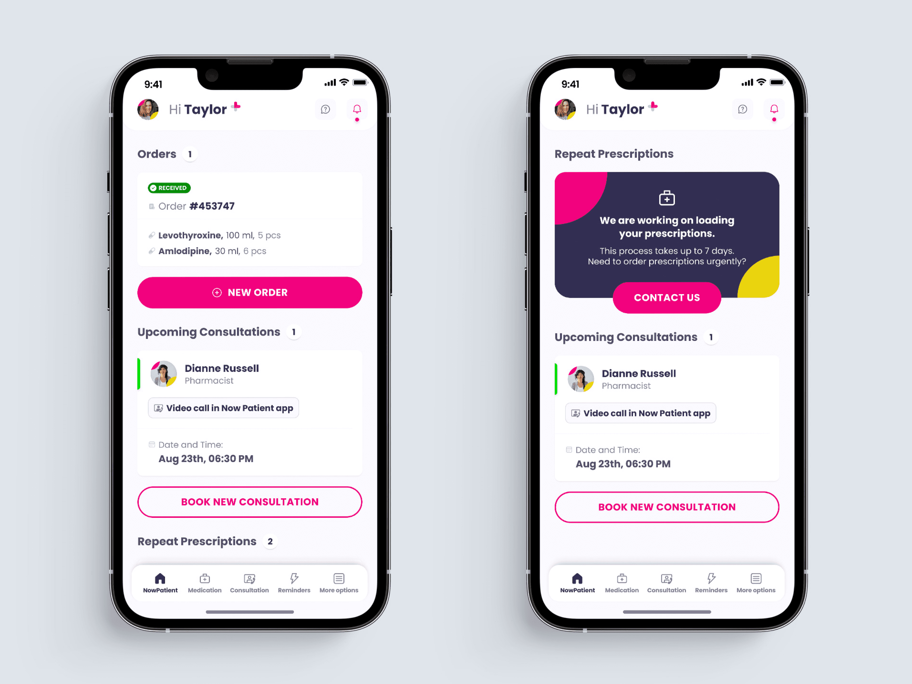
I designed the home screen to put the correct primary action in front of each type.

At any moment only one card is filled — the other stays neutral and outlined. There's never a decision to make between two competing calls to action, just the single next step.
That structure also keeps a commercial path open without leaning on the sensitive ask. Consultations are paid and don't require an NHS code, so a user who isn't ready to hand over NHS credentials still has a complete, immediate route into the product — book a consultation, order non-prescription items. The trust-building request and the revenue path run in parallel rather than one blocking the other.
Once the code is in, the middle state sets expectations honestly rather than leaving the user watching an empty screen: it names the process, gives a realistic timeline, and keeps support one tap away, so a wait that would otherwise feel like a failure reads as something in hand.
I paired the move with two supports: an explanation of why the code is needed and how it will be used, since the research was explicit that explanation converts reluctance into willingness — and a video instruction, because some people simply don’t know where to find their code and would otherwise abandon at that step.
Reminders spare users from tracking refills themselves or maintaining their own calendars. They also mean people reorder on time, which is revenue for the company.

The medication list only offers what's actually on the user's prescription record, so there's nothing to search and nothing to get wrong.
Delivery pre-fills from the profile, user doesn't need to type anything unless address was changed.
Payment step is adjusted to English prescription system. Naming all three plainly, with an explanation available for exemption, means the user never has to guess which one they are.

05 / TESTING
5 participants completed the core tasks against the prototype. The findings fed directly into the following round of design iterations.

06 / OUTCOME
What I designed: a registration flow restructured around when users are willing to share sensitive data, a home screen serving two distinct user types, and a reminder system that reduced user effort while supporting reorder revenue.

07 / REFLECTION
Compliance requirements aren’t obstacles to design around — they’re sequencing problems. The NHS code didn’t need removing, it needed relocating and explaining.
In healthcare, explanation is part of the interface. Most of what made this app feel trustworthy was telling people why something was being asked, at the moment it was asked.